Homepage
http://charlottewhite92.blogspot.com/
Research Analysis
http://charlotte-analysis.blogspot.com/
Social Groups
http://socialgroups-charlotte.blogspot.com/
Initial Ideas
http://initialideas.blogspot.com/
Front Cover Process
http://frontcoverprocess.blogspot.com/
Contents Page Process
http://contentsideas.blogspot.com/
Double Page Spread Process
http://doublepagespreadprocess.blogspot.com/
Final Outcomes
http://finalmagazine-charlotte.blogspot.com/
Evaluation Questions
http://charlotte-evaluationquestions.blogspot.com/
Tuesday, 30 March 2010
Wednesday, 10 March 2010
Double Page Spread Photoshoot


For my double page spread i carried out a photoshoot. This then meant that i was able to put together a double page spread using original images. For example all of the photos below were shot in a location situation rather than in a studio. I chose to do this as i felt it would be a lot more beneficial to the genre of my magazine and help create the right overall effect.

 This first photo that was taken in the location setting is the image that is going to be used as a smaller photo on my double page spread. I have chosen to use this photo as a smaller image along with the photo below because i feel that as they were both from the same shoot this creates consistancy in the magazine. The image above is a mid shot low angle and the image below is also a mid shot low angle. Both these images convey similar iconography to the reader. They both show the way in which she is fashionable and stylish but at the same time shows some individuality and wanting to stand out from everyone else. Also the positions that she is posing in makes her seem as though she likes to live on the edge, stand out from everyone else and be daring and this is the image that is wanted for magazine to create.


 This first photo that was taken in the location setting is the image that is going to be used as a smaller photo on my double page spread. I have chosen to use this photo as a smaller image along with the photo below because i feel that as they were both from the same shoot this creates consistancy in the magazine. The image above is a mid shot low angle and the image below is also a mid shot low angle. Both these images convey similar iconography to the reader. They both show the way in which she is fashionable and stylish but at the same time shows some individuality and wanting to stand out from everyone else. Also the positions that she is posing in makes her seem as though she likes to live on the edge, stand out from everyone else and be daring and this is the image that is wanted for magazine to create.
Tuesday, 23 February 2010
Wednesday, 27 January 2010
Existing Double Page Spreads

Before creating a double page spread for my magazine i chose to look at and analyse some existing double page spreads that i think are appropriate to the genre of magazine that i am wanting to create. By looking at existing products that are on the market i can makesure that i follow the codes and conventions and also have a chance to challenge them.
I have noticed that on the double page spread there is no masthead or logo mentioning or helping the reader recognise that they are still reading NME magazine.
There is an image which is situated on the right hand side of the page and this takes up a large amount of space. This image has been taken in a studio situation as everything the surroundings aren't very 'natural' and they are indoors. We can see this because it looks as though they are sat on a bed in a bedroom and things like posters on the wall and the actual bed suggest this. I think that having this image and having it a relatively large scale draws the readers attention to the page. This could be when they are just flicking through the magazine and something may catch their eye. Also the large image breaks up the condensed amount of text that is shown in columns on the left hand side of the double page spread.
Althought the text on the left appears daunting to the reader it is made to look more appealing by being surrounded by photographs and smaller bits of texts with other images.
Overall this double page follows the general codes and conventions that are associated when looking at this type of media text.
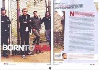
I also decided to analyse a second double page spread this was so that i could compare the similarites and differences between the two. It also helped me when thinking about designing my own and deciding what codes and conventions i should follow and the ones which i can challenge throughout my work.
Once again this magazine features the large photograph on the right hand side of the page and creates a similar effect that the image on the NME double page spread has. It becomes attractive and appealing to the reader when flciking through a magazine and grabs their attention which makes them feel more inclined to stay located on that particular page. The image that has been photographed is a group shot of the band it has been taken in an outside location where it tries to portray the band in a more 'natural' and 'realistic' type of setting.
Also the colours that are used for the text are the same as those that are shown on the front cover. This tends to be key throughout most magazines and is therefore a typical code and convention. In Q magazine it tends to be the colours red and white which are used conventionally throughout. Keeping the same colours may help to keep the readers engagement and attention.
Another thing that is similar to the double page spread from NME is that the text is also located on the right hand side of the page but this time rather than being separated into two columns the text is written in one straight block.
Subscribe to:
Posts (Atom)